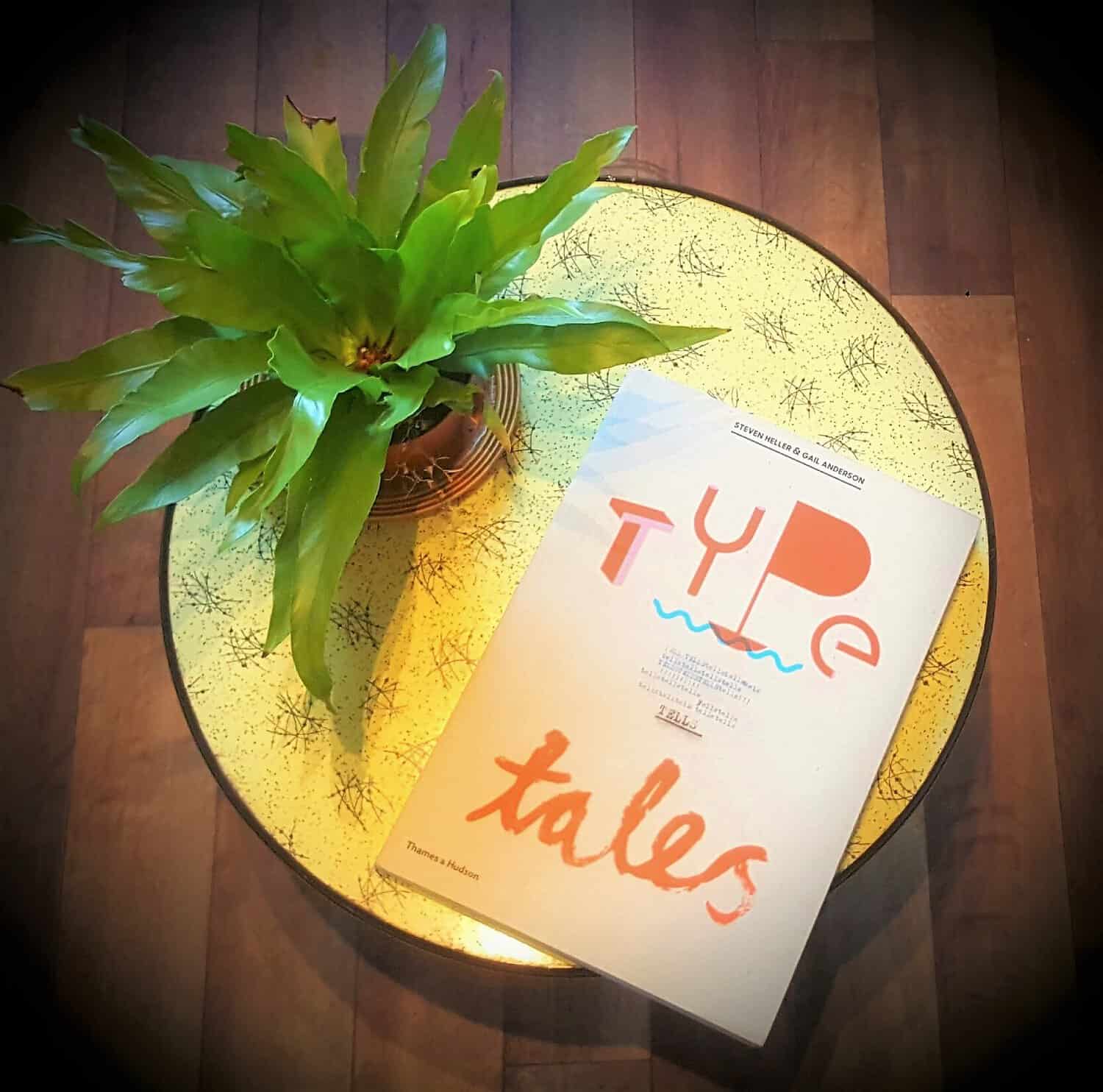
When words are not enough, text does the talking. Type Tells Tales, and Lisa Grabowski lends an ear…
A blank page is a most daunting thing. Writers stare into this abyss all too often, fingers poised above the keyboard with anticipatory tension, hoping that their muse will arrive soon from wherever they’ve been hiding.
It is akin to an artist staring at a fresh canvas, brush in hand, wondering where the heck their muse has buggered off to (probably down the pub with the writer’s, enjoying a pint and a moan about the constant demands of artistic types).
For the typographer, however, there is no abyss. Muse has been located, dragged out of the pub and thrown in the shower to sober up. The once daunting sheet is now covered in text, words providing content and context, a clear direction for whoever is approaching the page. The typographer has it easy. They just need to make it look pretty, right?
Well, not according to Steven Heller and Gail Anderson.
Through Type Tells Tales, Heller and Anderson set out to illuminate (pardon the pun!) the typographer as more than cosmetic surgeon. They show them as artists, wordsmiths, inventors, pioneers, each approaching the page from differing angles and motivations.
This is a beautiful book. This is an inspiring book. And this is, let’s face it, a very big book! But it’s not some dry, academic tome, droning on about the technicalities of type setting and minutiae of point size and line spacing. In fact, there is very little original text, Heller and Anderson choosing to summarise their theory then briefly introduce us to each piece, letting the typographer do the talking through their work. Not quite a directory, not quite a Who’s Who, it’s more like an excited friend tugging you by the hand, eagerly exclaiming “You should come and see this!”
And they have a lot to show us.
We’re led to the gothic world of Herman Inclusus, his novel Dismal Incantation transformed into a twisted, Medieval manuscript through the painstakingly time-consuming creation his own typeface.
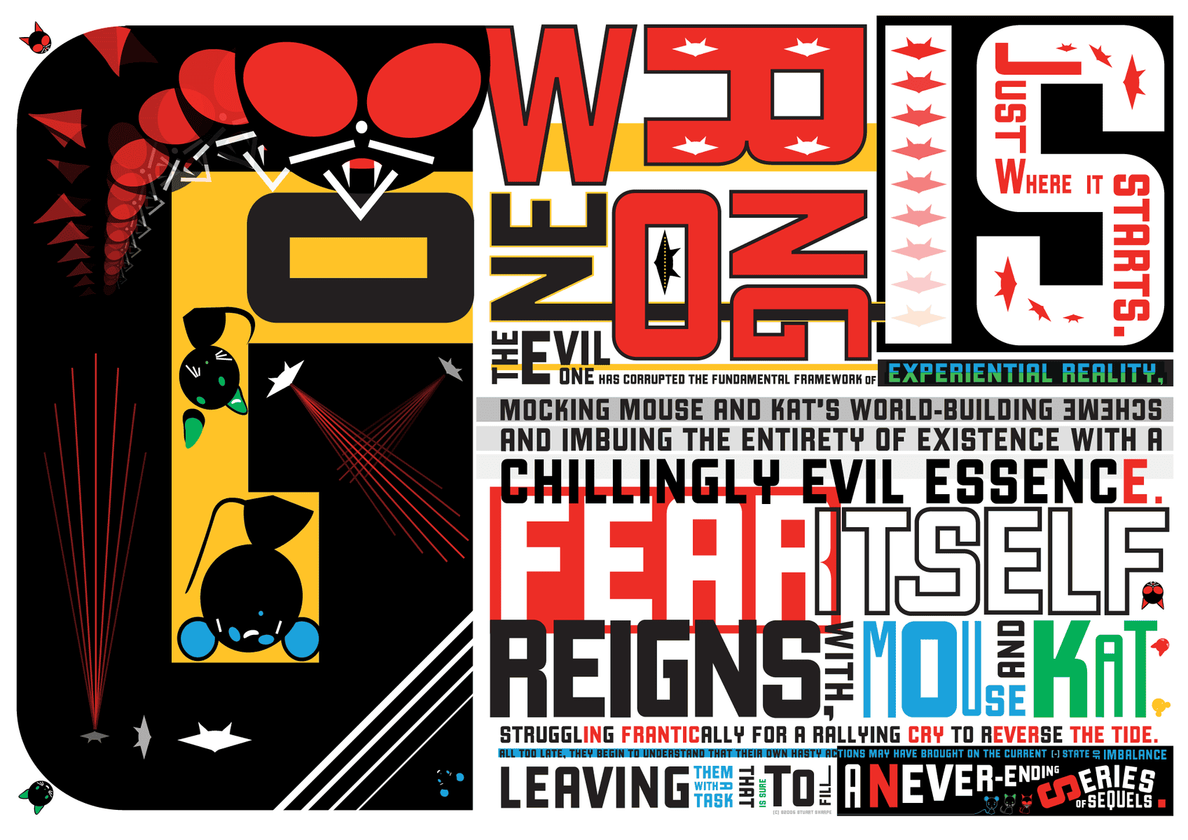
We’re introduced to Mouse and Kat and the Evil One, beings who, upon their birth, demanded a voice from their illustrator Stuart Sharpe and thus a bold, geometric font was forged to take them (and the reader) on an epic Sci-fi adventure.
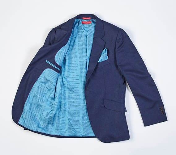
We divert off the page and are shown how the medium of typography is not bound to the leaves of printed publications. We see design partnership Sawdust moulding electrical wire into a commentary on copper theft, Nick Reeve entwining of the emails of courtship into the lining of his wedding suit and the hand-cut meditation of Antonius Bui’s Your Song producing a fragile memory of a lost friend.
Words are juggled, taken apart letter by letter and repositioned into expressive images such as the quirky eponymous animals of Bembo’s Zoo, the disintegrating text of Jason Permenter’s Erosion and Typography and the awesome planetary wonder of Alexandra Beguez’s The Subtle Cosmos.
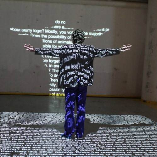
We discover how words can be a performance. The lyrics of David Bowie’s Sue (Or In A Season of Crime) projected onto a distressed, nocturnal world in the accompanying film by Tom Hingston. The words stretch and bend, flash and linger, mirroring Bowie’s voice and adding thrill to the already dramatic music. In their installation In Order to Control, NOTA BENE Visual insist that we get off our seats and make a move, to get political by manipulating text through our physicality, working together to make sense of the piece.
Type Tells Tales is a compelling tour of the world of typography and, like all good tour guides, it points its flashlight at the main attractions. In the periphery, we see hints of the alleyways, the darkened nooks we have yet to explore. Our appetites are whetted, eyes opened and we can now see the skill, imagination and versatility the typographer brings to the written word.
Something tells me that I ought to have used a more imaginative font to write this review. But that now just seems like too much hard work!
Lisa Grabowski is a freelance artist, hunter of bunkers and friend to obnoxious concrete architecture.